Wednesday, October 20, 2010

A Deeper Look at the Bouncing Ball

I found this really GREAT lecture about the bouncing ball by Brendan Body, and thought I should share it with you.

here are some of the notes I took:


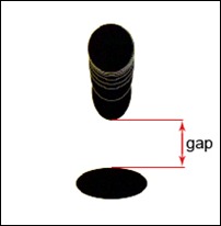
Bouncing_Ball_Gap
  • The gap -shown in the image- is a crucial part of the bouncing ball, it gives the animation it’s push and weight. The bigger this gap is, the lighter the object. The smaller the gap, the heavier the object.


  • The stretch of the ball is only used when the ball is moving fast. If the stretch is applied when the ball was moving slowly it would destroy the illusion of a solid object and we would get the effect of something far more flexible, such as a water balloon.

  • Common Mistake: "Adding more frames to squash adds more weight to an object".
More squash will make the object look like a small jumping creature such as a frog. Also by having only one frame of squash, the illusion of the weight will be lost.

  • Frank Thomas vs Richard Williams:-
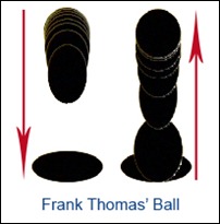
Frank_Thomas_Ball
Frank Thomas: when the ball hits the ground it has more impact because it goes from one extreme to another, and when the ball goes off the ground it has a feeling of acceleration,  it doesn’t ping off the ground like Williams’ version.


Richard_Williams_Ball
Richard Williams: you can sense the change of shape in the ball as it contacts the ground.


  • Applying the Bouncing ball to a character:-                                   
Apply_Ball_on_Body
The three balls represent the three body masses (hips, ribcage and brain-case).
The ribcage ball has an offset of one frame from the hips ball, and the brain-cage ball has another frame offset (two frames from the hips).


By applying the bouncing ball to body parts we can be confident  they will appear weighty and by offsetting them we can achieve a fluid action.

From Brendan Body 's Lecture: http://bouncingballlecture.blogspot.com/

Squash and stretch should be added to the parts of the body that can distort (hair, ears, tails, muscle, fat, and the spine).

Monday, September 27, 2010

Animation = Timing + Spacing

First of all, timing means the number of frames needed for an object to move from point to point. Spacing means how the object moves from frame to another. The following image explains it all,

timingSpacing

although both balls will arrive at the same time from frame1 to frame25 =>same timing, but you can see that the second ball is slowing out of frame1 and slowing in to frame25 => Spacing changed.

This made a huge difference, the first ball is boring and robotic but the second ball is amusing and more realistic, nothing in real life moves like the first ball, take for example when you drive a car you can’t start the engine and move at 80km/hr instantly, the same when you stop the car you can’t make a sudden stop unless you hit an extremely huge rock :)

That was how important the spacing is, what about the timing? let’s face it, how would you feel if you watched a whole movie in slow motion…BORING ,what about watching a movie in fast forward…you will miss lot’s of things and you will be a genius if you understood anything. Varying the timing has meanings, if someone is tired or bored his timing should be slow, and if someone is excited his timing should be fast.

If you are animating a shot you can video record yourself acting the same shot and it will help you figure out the right timing and spacing, of course you will not copy the motion, you need to put your touch (ex: exaggeration, ignoring some moves,…) to make it more appealing.

For more information watch this awesome webinar “Give meaning to movement” by pixar animators Aaron Hartline & Victor Navone.

Have Fun Animating :)