Wednesday, July 11, 2012

Animating Eyes

Ten Things to Think About - #9 Eyes:

10 Things to Think About - from the book Thinking Animation by Angie Jones and Jamie Oliff.
 
This is one of the lectures I use at the online school ianimate.net.  I created this list for my book Thinking Animation to help animators create a clear and solid message with their work.  I will post the 10 Things to Think About over the course of the next 10 weeks.  ~Enjoy!


#9 Eyes: (This particular lecture is much longer when I teach.  This is just scratching the surface regarding eye animation.)

Basic Notes on animating Eyes:
  • Eyes are windows into the soul and the soul is controlled by the mind.
  • Eye darts and glances tell more than any other gestures in the body when used in the right place in the scene.
  • Desire is always described in the eyes, even when hidden through subtext acting choices. 
Overview of Eye Movement:
  • Never animate without a reason! 
  • Force vs. Form
  • Look for patterns in the eye darts = Social Triangle – Right Eye, Left Eye and then mouth.

    ...eye shape:  when the iris moves around the eye the lid cuts across it changing its shape from round to oval.
    ...lid shape:  The lid itself changes shape as the eye line changes and the brow pushes down on it with emotional poses.  The lid also changes shape as it tracks with the eye line.  Even if you have a soft eye resolver attached to the lids, I still animate the lids as blinks and eye darts happen.
    ...darts:  Darts tell us the character is thinking, confused or trying to understand something.  It can also tell us if they are nervous, shy, present, angry and many other emotions depending on the timing.
    ...pupils:  Dilated and un-dilated pupils tell us more… Dilated shows interest, love, warmth.  Un-dilated eyes show fear, intensity or a bright light being show at the eye.
    ...blinks:  Never blink unless there is a reason!  Why do we blink? Dry Eye? Cut to next scene in our mind? Emotional Cues - Shy or nervous vs. Angry or High
    ...brows:  Brows shapes are reinforced in the lids.  They all move together to create the eye animation. Usually the break in the eyebrow relates to the highpoint of the eye. The eye is pulled by the eyebrow muscles.


    Watch the eye darts as Charlize Theron plays Aileen Wuornos in the movie Monster.  They describe her insecurity, her uneasiness and fear that someone might overhear her conversation, not mention the fact she is lying.

    Eye Darts:
    • No more than 1-2 frames then hold it to register what char is looking at.  If there is any ease, it happens at the end of the dart.
    • Linear Curves, I only put eases on slower eye motion. I tend to sculpt motion with tangents.  If you prefer to set a lot of keys to create your motion, then I would advise putting eases into your eye darts with your keys.
    • Dart then stay -and dart then stay, if you do not stay in one place the eye dart will never read.  You can use two eye darts to move the eye a far way, so it still reads as an eye dart.  Otherwise it’s just a look.

    • Triangle Motion: left eye, right eye, mouth.  This is the basic motion most eye darts take when conversing.  Even when the other person is not speaking we tend to look back and forth in this triangular motion to read the other person’s face.
     The social triangle of eye darts.

    • Be careful with how far you tilt the yes on the social triangle for eye darts or it will move into an intimate gaze zone.  When people approach each other from a distance, they look quickly between the other person's face and lower body to first establish what the sex of the person is and then a second time to determine a level of interest in them. This gaze is across the eyes and below the chin to lower parts of the person's body. In close encounters, it's the triangular area between the eyes and the chest and for distant gazing it's from the eyes to the crotch or below.
     The intimate gaze zone for eye darts.
    • Also be careful to not raise the darts higher than the brow line.  Then, you are entering the power gaze zone. Provided your gaze doesn't drop below the level of their eyes, the pressure will stay on the person being gazed upon. Never use this in friendly or romantic encounters. It works well for intimidation.

     The power gaze zone for eye darts.

    • When to use eye darts?  Thought process… shows thinking.  Stress, Assessing.  Moving holds are when they read best.  When your character has stopped moving so much and you can read them.
    • Eye Darts and the head and neck.  Nothing in the body is ever still. Occasionally the head will make a slight movement after the eye darts one way or another.  Very slight though.  Have you ever ridden a motorcycle?  The bike will go where you are looking naturally, so do not look at the curb!  Same thing goes for your head and the eyes.


    Hugh Grant has signature blinking he uses for his 
    fumbling characters who always seem out of sorts.

    Blinks and Lids:
    • On most character designs the upper lid covers most of the eye and the lower lid, barely moves to reach.  The blink line is usually ¾ down on the eye, not in the middle. The closed position is actually an overshoot of the upper lid pushing on the lower lid.
    • Everything I just said above can be affected / changed by emotional cures, lid shapes and other triggers.
    • Lots of blinking shows insecurity, bumbling, nervous and confused.  A direct stare is connected to emotions like fight or love.  Check out the movie I uploaded to the social group on Michael Caine.  Fear = no blinking.
    • Length of blinks.  Get inside the head of your character… if they are sleepy the closed position would be longer than a “zoinks!” WTF kind of blink. Slow blinks can be triggered by sadness, boredom or sleepiness or drugged.  Half Blink and twitches again show uncertainty in what the character is seeing or hearing.
    • On average it takes more frames to open the eye than close it due to momentum.  Ease out to open, but less to no ease on a closed eye.
    • Offset shapes in eyes to create more natural motion and then the actual closed point should be on the same frame and then eases are offset again as they reopen.  I think the Pixar blink can feel sleepy.
    • Move the eye line on a blink when the eye direction changes, if you don’t it will look weird.
    • Double take usually involves all of the blinks = full, half and twitchy blinks.  Check out the double take example I uploaded to the social group.
    • Shape the lid to compliment the brow shapes… angles up and down create added emotion.  A blink that arcs down is more elegant looking.  A blink that arcs up usually works with a squint and is related to happy blinks.


    Squinting:
    • Squints tend to happen on “T’s”, “S’s” and “P’s
    • An antic like a squint before blinking can help slower blinks or create emotional cues of a change in emotion during the blink.


    Brows:
    Brows move down a little on a natural blink.  This is even more extreme for cartoony characters.  On a longer blink an eye crunch can happen.  This action happens before the lids pushing down on a blink and pulling up on the open.


    Pupils:
    • If you have an extreme close up, you can adjust pupil size too.  Dilate = pleasure.  If you are excited, your pupils can dilate up to four times. Conversely, if you are experiencing anger or another negative emotion, your pupils shrink in size.  Dilating pupils are also signal of courtship. Maybe this is the reason why romantic encounters succeed in dimly lit places, because pupils naturally dilate in such light conditions.

    Dilating Pupils...

    • Don’t occlude more than 50% of the pupil.  You will look interest and appeal in your poses.
    • If the lid covers the eye too much it looks sleepy or drugged.  A soft eye solution will have to be countered many times depending on the angle of the head and the camera.
    Eye Accessing Cues:


    To get an idea how your eyes move, consider the following questions. For each question, as you think of the answer, notice the direction(s) your eyes move (up down or to the side) or if your eyes do not seem to move notice if you have a sense that you are looking in a certain direction (even if only for a fraction of a second).
    • What is the color of your front door?
    • What will you look like in 15 years?
    • What does your favorite music sound like?
    • What would your voice sound like if you had marbles in your mouth?
    • When you talk to yourself, what type of voice do you use?
    • What does it feel like to be in a nice warm bath?
    Did you notice your eyes had a tendency to look up for the first two questions, to the side for the next two questions and down for the last two questions? In general, if you are making a picture in your mind your eyes will tend to go up to the left or the right, for sounds laterally to the left or right, and down to the left or right for feelings or when you talk to yourself.
    More specifically, if you are right-handed, you may have noticed the following (for people who are left handed, interchange left and right in the following text):
    Question 1 - eyes up and to your left. This is a question about something you have seen before and hence you remembered it -- visual remembered (VR).
    Question 2 - eyes up and to your right. This is a question about something that I assume you have not seen before and hence you constructed this picture - visual constructed (VC).
    Question 3 - eyes on the horizontal plane to your left. This is a question about something you have heard before - auditory remembered (AR).
    Question 4 - eyes on the horizontal plane to your right. This is a question about something you have not heard before - auditory constructed (AC).
    Question 5 - eyes down and to the left. This is a question about your self-talk - auditory digital (Ad).
    Question 6 - eyes down and to the right. This is a question about your feelings- kinesthetic (K).

    Note: The above eye patterns are how your eyes would move if you are right-handed. The following picture describes the eye patterns for a right-handed person as you look at them - please note this distinction. These patterns are fairly consistent across all races, with the possible exception of the Basques, who appear to have a number of exceptions to the rule. For many left-handed people, the chart is reversed i.e. mirror image.


    One last note on eyes...
    Remember: The shape of the eye changes, as the eye direction changes.  Not literally.  It's an illusion.  This is why traditional animation literally changes the eye shape.  To simulate the illusion the lid creates over the eye.


    Tuesday, May 29, 2012

    Actors and Animators: "vive la différence!"


    The actor is the actor.
    The animator’s on-screen character is the actor.
     
    The actor acts “in the present moment”.
    The animator creates an illusion of a present moment.
     
    The actor never thinks about facial expression of emotion.
    The animator always thinks about facial expression of emotion.
     
    The actor wants the person in the audience to empathize with him right now.
    The animator wants the person in the audience to empathize with the on-screen character later.
     
    The actor’s instrument is himself.
    The animator’s instrument is a pencil. Or a keyboard.
     
    The actor cannot act if she has laryngitis.
    The animator can animate if she recently had a leg amputated.
     
    The actor is a self-employed person.
    The animator wishes he was a self-employed person.
     
    The actor never rehearses in front of a mirror.
    The animator always rehearses in front of a mirror.
     
    The actor plays with a variety of other actors.
    The animator plays with himself.
     
    The actor’s first question: “What am I doing?”
    The animator’s first question: “What does the character look like?”
     
    The actor’s first thought on a new stage: “Is there anything I might slip on or trip over?”
    The animator’s first thought in a new studio: “Where is the kitchen?”
     
    The actor pretends.
    The animator pretends to pretend.
     
    The actor receives applause immediately after his performance.
    The animator receives applause after he dies.
     
    The actor, being human, is already halfway to a successful performance simply by showing up.
    The animator is halfway to success only if Andy Serkis shows up.
     
    The animator gets to stare at pixels on a computer screen all day.
    The actor gets to stare at Jennifer Anniston.
     
    The actor dreads tech rehearsal.
    The animator dreads crunch time.
     
    The actor does relaxation exercises.
    The animator drinks Red Bull.
     

    From Ed Hooks monthly newsletter http://actingforanimators.com/

    Sunday, May 6, 2012

    Jeff Gabor Awesome work

    AWESOME work of Blue Sky very talented animator Jeff Gabor “Horton Hears a Who” comparison reel, and "Ice Age" animation walkthrough


    He is soooooooo talented and definitely he works very hard

    Tuesday, May 1, 2012

    Drawing for Animation

    This is an Awesome drawing lesson from Karmatoons, I know it’s 2D but 3D animators will find it useful too, it also discusses the principles of animation, so have fun and keep animating :)

    I gathered the lesson in a pdf file, click on the image below to view/download it

    Drawing_Disney

    Thanks Karmatoons sooooo much

    Source: http://www.karmatoons.com/drawing/drawing.htm

    Saturday, April 21, 2012

    Work on Blocking and avoid frustration

    An important trick if you have a problem when you turn to spline, mostly in blocking phase the animation looks solid but the moment you turn to spline everything moves in horrible way, wish this trick helps in avoiding that.

    Monday, March 19, 2012

    Animation: Common Beginner Mistakes

    The 11SecondClub Hints are extremely useful, The hint about The Top Five Mistakes helps a lot if you want to improve your skills, The top five are discussed in details, Don’t miss it :)

    The Top Five Mistakes:

    1. "YOU AREN'T READY FOR THE COMPETITION."
      "YOU SHOULD RETURN TO THE BASICS."
    2. "YOU NEED STRONGER POSES."
    3. "YOUR ANIMATION FEELS TOO SWIMMY / TOO COMPUTER-Y / TOO WEIGHTLESS."
    4. "YOUR CHARACTER'S ENERGY DOESN'T MATCH THE DIALOGUE."
    5. "YOUR CAMERA MOVES ARE MUCH TOO DISTRACTING!!
      I CAN'T SEE YOUR ANIMATION BECAUSE THE CAMERA IS MOVING SO MUCH!"
    SassyPose


    And I came across this Blog post, It was about common mistakes too, Below are the mistakes discussed:

    • “Glitch” of all kinds and nature!
    • Weak pose or having a bizarre pose somewhere in our animation
    • Having poses in motion, paid attention to poses than should not exist
    • Not having enough change, angle change, position change, pose change : Well Contrast. It's about abstraction of masses and not seeing your character as different body part but as a few big Bouncing Balls
    • Sometime I put too much emphasis on the feet, which is not always necessary since the audience look generally at the head
    • Arms and legs are moving independently from the rest of body
    • Put a key on the hip every time I’ve put a key on the arms or legs
    • Add more Breakdowns (keyframe on the timeline) to “correct” a movement that is already wrong
    • I had the tendency to spend too much time in my first blocking pass with my keys next to each other’s, and not working on my timing until I had many keys and breakdown in my timeline
    • It should be obvious, clear what is happening in the animation when we look at our blocking

    Wednesday, February 15, 2012

    How to animate a walk cycle in details

    A very detailed step by step pdf on how to animate a walk cycle, it uses maya but nothing special program wise, if you are not using maya it will be very useful too.

    Download here

    Capture

    found it here http://www.howtocheatinmaya.com/chapters_2012.html

    Saturday, February 4, 2012

    Stepped to Smooth

    Doron Meir explains how to go from stepped to spline

    In part1 he discusses the advantages of using stepped keys to design the shot (AKA "blocking")

    In the second part of the tutorial, he adds some motion info to the raw acting keys. He shows how to use the tweenMachine script to introduce inbeweens and breakdowns.

    The 3rd part of the tutorial deals with some of the common pit-falls of working in stepped mode.

    In part 4 we study the inherent timing cheat we apply (without realizing it) when we work in stepped mode, and how to deal with it when we come to smooth our animation.

    In part 5A he mostly explains about what he’s going to do, and in part 5B he mostly does it :)


    Tuesday, January 31, 2012

    Eye Movement and Direction

    The audience will be looking at your character’s eyes, take good care of them


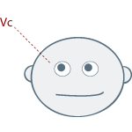
    vc_eyes

    Up and to the Left:
    Indicates: Visually Constructed Images (Vc)
    If you asked someone to "Imagine a purple buffalo", this would be the direction their eyes moved in while thinking about the question as they "Visually Constructed" a purple buffalo in their mind.


    vr_eyes

    Up and to the Right:
    Indicates: Visually Remembered Images (Vr)
    If you asked someone to "What color was the first house you lived in?", this would be the direction their eyes moved in while thinking about the question as they "Visually Remembered" the color of their childhood home.


    ac_eyes2

    To the Left:
    Indicates: Auditory Constructed (Ac)
    If you asked someone to "Try and create the highest the sound of the pitch possible in your head", this would be the direction their eyes moved in while thinking about the question as they "Auditorily Constructed" this this sound that they have never heard of.


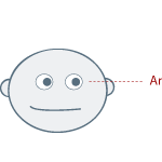
    ar_eyes

    To the Right:
    Indicates: Auditory Remembered (Ar)
    If you asked someone to "Remember what their mother's voice sounds like ", this would be the direction their eyes moved in while thinking about the question as they "Auditorily Remembered " this sound.


    f_eyes

    Down and to the Left:
    Indicates: Feeling / Kinesthetic (F)
    If you asked someone to "Can you remember the smell of a campfire? ", this would be the direction their eyes moved in while thinking about the question as they used recalled a smell, feeling, or taste.


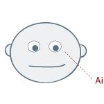
    ai_eyes2

    Down and To the Right:
    Indicates: Internal Dialog (Ai)
    This is the direction of someone eyes as they "talk to themselves".


    Source: http://www.blifaloo.com/info/lies_eyes.php

    Saturday, January 28, 2012

    Visual Comedy, Laughing Matters

    Notes from Carlos Baena’s website, from the Documentary "Funny Business" also known as Laughing Matters hosted by Rowan Atkinson:
    1) Great comedians don't just talk, but use visual humor as well. Using their body as a tool:
    a. There is comedy potential in every body part.
    b. Clothes play a big part (too small or too big).
    c. Character can look funny.
    d. (My addition) The body can interact with other props to create humor (or alone).
    2) Funny Things: Three Basic Principles:
    a. Objects behave in an unexpected way
    b. Objects go to or appear in an unexpected place.
    c. Objects shown the wrong size.
    - Combining these three principles may not make the business more funny.
    - Jokes depend on sudden shocks and strange transformations that under-mind the laws of our existence.
    3) Slapstick and Violence (the earliest and perhaps most crude form):
    a. The more realistic, the funnier the gag.
    b. The more dignified the victim, the funnier the gag.
    c. Shock of violence must be separate from the reality of pain.
    d. Use of overstatement or understatement create this comedy.
    4) Magic & Surrealism (the comedian uses the Illusionist's tricks):
    a. Appearing and Disappearing - gags are funnier if the character disappears.
    b. Transformation - must absurd as well as astonishing
    c. Speeding things up (or slowing down)
    d. Comedy rooting in fear
    e. Strange images
    5) Imitation & Parody (a step up, but not the highest form of comedy):
    a. Exaggeration creates a parody
    b. Representing authority creates satire.
    c. Using other's story's or material can create comedy, but the effect lessens with the popularity of the others' material.
    6) Mime & Body Language (Moving into character and situational comedy):
    a. Create an interesting character.
    b. Can be simply in the shading of a facial expression.
    c. Not about doing funny things but doing normal things in a funny way: with personality.
    d. new attitudes make the old joke new.
    1. Dim (stupid) - knows less than the audience - has a bewildered innocence.
    2. Aggressive - lack of consideration for others.
    3. Crude - comedy of social embarrassment or vulgarity.
    4. Etc.
    e. Only if you identify with an attitude will you laugh.
    f. Charlie Chaplin is one of the most skilled at this type of comedy, but doesn't always get the laugh (while he does draw smiles and emotions).
    (We have to make our jokes and characters timeless, though some will argue that Chaplin was timeless)
    7) Qualities that transcend time: The character of the physical comedian.
    a. Like us but different - an alien on the other side of the mirror.
    b. Innocence - born yesterday
    Battles with normal objects
    Constantly makes mistakes
    Tenacity - keeps doing things when others would've given up.
    c. Socially Inept - either doesn't understand conventions or doesn't know how to follow them.
    d. Drunkenness is an alternative to childishness
    e. Hard to form normal relationships
    f. Constant hostility from all quarters
    g. The comedian can't die or get seriously hurt.
    8) The opposite of all rules are true: ALL rules can be broken.


    Monday, January 23, 2012

    Thursday, December 8, 2011

    Inspiring Milt Kahl Quote

    “It’s a very difficult medium. Animation necessarily requires a pretty good draftsman, because you’ve got to turn things, to be able to draw well enough to turn things from every angle. You have to understand movement, which in itself is quite a study. You have to be an actor. You have to put on a performance, to be a showman, to be able to evaluate how good the entertainment is. You have to know what’s the best way of doing it, and have an appreciation of where it belongs in the picture. you have to be a pretty good story man. To be a really good animator, then, you have to be a jack-of-all-trades. I don’t mean to say that I’m all these things, but I try hard. I got accused over the years of being a fine draftsman. Actually, I don’t really draw that well. It’s just that I don’t stop trying as quickly. I keep at it. I happen to have high standards and I try to meet them. I have to struggle like hell to make a drawing look good.”

    Milt P 1.jpg

    Tuesday, December 6, 2011

    Balance in motion

    AnimSchool Instructor and DreamWorks Animator, JP Sans, demonstrates the role of balance in motion for making a character walk.

    Source: http://www.animschoolblog.com/2011/12/animschool-classtime-making-character.html

    Monday, December 5, 2011

    Animate Forces Instead of Forms

    This is veryyyyyy important, and I have to say it will take lots of time to master, I will keep practicing…
    OK, What am I talking about? sorry , It’s Animating FORCES not FORMS, this might be obvious but believe me it has more depth, and as Keith Lango described it at the end of his article by saying: "This stuff has been under our noses for decades, described in a different way. See, animation books have been describing this activity in motion for years. It's been called overlap, overshoot, lag, weight, successive breaking of joints, sometimes erroneously called secondary action, etc."
    I remember reading Don Graham notes about animating Forces not forms, and it was very confusing, I think I will read it again now maybe I will understand anything :)

    here is the full article of Keith Lango:
    http://www.keithlango.com/tutorials/old/LeadFollow/leadFollow.htm

    Monday, November 7, 2011

    Glen Keane lecture at Calarts

    Glen Keane animating a scene, do I have to say more ;)

    I like the way he is thinking at every frame what the guy is thinking and draw accordingly, it’s not only about making the move works, it’s about making the guy makes the move, awesome!


    Sunday, October 30, 2011

    AnimSchool Free Rig, Malcolm

    Great Rig from AnimSchool, it’s available for Softimage and Maya.

    What are you waiting for, Download the rig now, just sign the agreement and they will send you a download link.

    and that’s a video on how to use the rig


    Happy Animating :)

    Sunday, September 25, 2011

    ANATOMY OF A FIGHT WEBINAR–Animation Mentor

    REGISTER NOW for the free webinar from the AWESOME school Animation Mentor

    11 October 2011, 10am & 7pm (Pacific Time) (in Egypt it will be 7pm “11 Oct” & 4am “12 Oct”)

    Don’t miss it :)

    Tuesday, September 6, 2011

    Physics of Animation (Balance & Weight Shift)


    I was searching for physics (as I haven’t got enough in college :D) but in animator’s perspective, and I found this site called Animation Physics, it has some great tutorials about animation physics, I picked some common examples to share it here with you, it’s from the balance & weight shift tutorial, download the complete pdf file here.

    Enjoy :)


    • Lifting Objects:


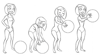
    light_weight_liftingIn this first example the object feels light as a beach ball. The lack of weight is indicated by how the character is posed holding the ball in her arms, away from her body. If the ball was very heavy then the center of gravity of her plus the ball would be located in front of her toes. In that case, no matter how strong she is, she’d fall forward (imagine her as a statue holding a heavy, solid ball).


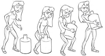
    heavy_weight_liftingThis lift conveys that the water bottle is heavy. The character does not extend her arms away from her body and she also uses her legs to help lift. Regardless of her strength, she needs to keep the heavy bottle close to her body so as to keep the total center of gravity (her plus the bottle) located over her base of support (her feet). She also leans backwards for the same reason.


    heavy_bag_liftingThe hiker’s pose on the left suggests that his pack is light. The pose on the right tells you that the pack is heavy because he has to lean forward to keep the total center of gravity over his base of support (his feet).


    • Rising from a chair:

    rising_from_chairYour base of support changes as you rise from a seated position and this affects the poses. When rising slowly the center of gravity needs to remain above this base for the character to maintain balance at all times. Notice that rising from a chair with arms is easier because the hands may be used to expand the base of support.

    If the character stands up quickly then some of the poses may be out of balance. If so then the motion slows into the standing pose, much like a rising ball slows into its apex.


    • Standing in Balance:


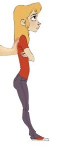
    standing_balanceBalance may be achieved with support forces pushing or pulling in the horizontal direction when those forces exert a balancing counter-torque. The character’s pose is obviously out of balance. The upward and downward forces are not aligned so they produce a torque that causes a rotation. The character tips backward and falls on her back.


    standing_balance_against_wallThe same pose is in balance when the character leans against a wall since the rotation is prevented by horizontal support forces. There are two horizontal forces that create the balancing counter-torque:
             * The wall pushes the character towards the right.
             * The frictional force of the ground pushes towards the left.
    It’s important to think about these forces because they affect the character’s pose (e.g., the angle of the lower leg as it braces against the frictional force pushing on the foot).


    standing_balance_being_pushedThe character’s pose is the same if the force on her back were due to someone trying to push her forward.

    Tuesday, June 21, 2011

    Richard Williams Animation Master Class Notes Taken by Dave Bailey

    “Sophisticated Use of the Basics” — Animation Master Class by Richard Williams

    Animator_Survival_Kit

    What is animation?

    • Change is the basis of all animation
    • There are two types of animation Morphing and the type that gives the illusion of life.
    • Animation is all in the timing and spacing
    • You must show where the weight is, where it is coming from and where the weight is going to.

    Keyframes: are the story telling frames (The story board drawings)

    Frames where the character makes contact (heel strike pose, touching an object, etc.)

    Extremes: are the where there is a change of direction. They are NOT Key Frames.

    Breakdowns: are the middle or passing position.
    On breakdowns always add an extra bit of movement — almost anything will work.
    Don’t go from A to B. Go from A to Z to B


    Methods of Working:

    1. Straight-Ahead - Just start and see what happens. (Creative but lacks control)
    2. Pose to Pose - (Lots of control but restricts creativity)
    3. The “Best” Method - A combination of “Pose to Pose” and “Straight Ahead”.


    Steps to take before animating:

    1. Before working turn off all other stimulus —“UNPLUG”
    2. Write down what you want to do
    3. Act it out
    4. Work out the timing
    5. Then animate


    The “Best” animating method:

    • Step 1 - Do the KEY frames (the story telling poses)
    • Step 2 - Do the frames that have to be there (the contact frames)
    • Step 3 - Do the breakdown poses (passing/middle poses) Don’t forget to add that extra bit of action.
    • Step 4 - Do Straight Ahead Runs of different parts in hierarchical order
      Testing along the way.
      (Hips first followed by legs then arms then head. Drapery is always last)


    General Guides & Tips:

    • The human eye can not see (comprehend) an action done in less then 5 frames, for an action to be readable it must be done in 5 or more frames.
    • The way I under stood this to mean was that the 5 frames could include the anticipation of the movement. For example a character could be held in a 5 frame anticipation and be off the screen in the 6th. The use of ease-in or ease-out would also be included in those 5 frames.
    • Mr. Williams also stressed that all the things he was teaching were general guidelines and theories and one should always have the courage to break the rules. Experiment and test often, the only thing that matters is if the final animation works!
    • Never exit the frame in less than 5 frames.
    • On in-betweens don’t animate in a straight-line use curved paths
      For fast/hard impacts, skip the actual impact frame. Go immediately from action to reaction.
    • A character should never take off or land on both feet at the same time.
    • Blinks frequently happen on a passing pose.
    • There are generally two frames between the open and closed positions of an eye during a blink.


    Walks & Runs:

    • On a walk only one foot leaves the ground at a time
    • On a run both feet leave the ground for at least 1 frame and the character is always down on the passing pose.
    • Always create your heel strike poses first.
    • A normal walk is on march-time - a heel strikes the ground every 12 frames
    • A Hollywood cartoon walk heel-strike is every 8 frames
    • A stroll heel-strike is every 16 frames
    • A normal run heel-strike is every 8 frames
    • Heel-strikes on the fastest run possible occurs every 4 frames (this only works for small characters)


    Overlapping Action:

    • Overlapping action is action that does not happen all at once.
    • I changed the word “breaking” to “bending” in the line below while taking my notes. It helped me differentiate between “A successive breaking of joints” - (breaking up the movement of an articulated object) and “breaking a joint” - (unnatural bending) Both concepts are used for the same purpose of getting smooth curvaceous movement. The whole idea of the broken joint is that it is unnoticeable to the eye, so, yes it can be used for realistic animation.
    • A successive bending of joints limber up movement — It’s an unfolding action.
    • If twinning is happening, think about what parts can be delayed.
    • Another example of overlapping action is delaying the movement of loose fatty tissue (Jowls) behind the quicker moving muscle and bone (skull).


    Counter Action:

    • A counter action is where one part moves in the opposite direction to counter the weight and thrust of another part.


    Breaking Joints:

    • The unnatural bending of joints to obtain curvaceous movement with straight line segments.
    • If the successive frames with broken joints are less than five and less then the number of frames with non-broken joints the distortion will not be noticed.
    • To really add SNAP to a movement put one “crazy” position the frame before the extreme position.
    • The word “crazy” was Mr. Williams’ but I think it’s a bit misleading. It is not an extreme. It is a slightly out of joint position a frame before the Extreme. After the extreme you would ease into a held position.
      He gave the following example: (Please pardon my crude diagrams)
      The example he gave was an arm making a pointing motion. Starting with the arm bent at the elbow (V), hand pointing up. On the end frame 7 the arm is straight out (—-), hand pointing forward. On frame 6 the hand is close to its final position but the elbow is broken in a reverse bend upward about 20 degrees (^-). I would not really call frame 6 an extreme more like a semi out of place in-between.


    Dialogue:

    • Consonants must have 2 frames to read - steal from the preceding sound if needed.
    • Hit the mouth accent on the vowel.
    • Vowels need 2 poses an accent pose and a cushion pose.
    • Pop the mouth open on vowels with an accent pose and immediately ease into a cushion pose
    • “Boil it down” - Keep the mouth movement simple.
    • Form the words (watch singers)
    • Lift the head 3-4 frames in advance of the modulation.
    • Upper teeth are anchored to the skull.
    • Women usually show upper teeth only.
    • Men (50/50) show upper or lower teeth only a rare few show both.
    • The tongue is hooked at the back of the lower jaw, not stuck in the throat
    • Never in-between the tongue, always snap it from one position to the next.
    • When giving dialogue a character should be progressing (or regressing) somewhere.
    • Get the body action right then add the mouth.
    • Break up the action and the dialog - do one thing at a time! For example talk then point or point then talk
    • Animate dialogue on level sync, then in post, test delaying the voice audio by approximately 2 frames to see what works best.


    Source: http://www.3dark.com/archives/richard_williams_notes.html

    Thursday, June 9, 2011

    Animation Notes From Ollie Johnston

    Precious notes given by John Lasseter at SIGGRAPH 94, hope you will enjoy it :)

    "When I was an animator at the Disney Studios, I had a xeroxed list of simple notes from one of the great Disney animators, Ollie Johnston, pinned to my drawing table. The list was originally written down by another great Disney animator, Glen Keane, after working as Ollie’s assistant for a few years."

    "These notes have been an inspiration to me for years. Even though they were meant for hand-drawn animation, I believe that they still apply to computer animation."

    1. Don’t illustrate words or mechanical movements. Illustrate ideas or thoughts, with the attitudes and actions.

    2. Squash and stretch entire body for attitudes.

    3. If possible, make definite changes from one attitude to another in timing and expression.

    4. What is the character thinking?

    5. It is the thought and circumstances behind the action that will make the action interesting.

      Example: A man walks up to a mailbox, drops in his letter and walks away.

      OR

      A man desperately in love with a girl far away carefully mails a letter in which he has poured his heart out.

    6. When drawing dialogue, go for phrasing. (Simplify the dialogue into pictures of the dominating vowel and consonant sounds, especially in fast dialogue.

    7. Lift the body attitude 4 frames before dialogue modulation (but use identical timing on mouth as on X sheet).

    8. Change of expression and major dialogue sounds are a point of interest. Do them, if at all possible, within a pose. If the head moves too much you won’t see the changes.

    9. Don’t move anything unless it’s for a purpose.

    10. Concentrate on drawing clear, not clean.

    11. Don’t be careless.

    12. Everything has a function. Don’t draw without knowing why.

    13. Let the body attitude echo the facial.

    14. Get the best picture in your drawing by thumbnails and exploring all avenues.

    15. Analyze a character in a specific pose for the best areas to show stretch and squash. Keep these areas simple.

    16. Picture in your head what it is you’re drawing.

    17. Think in terms of drawing the whole character, not just the head or eyes, etc. Keep a balanced relation of one part of the drawing to the other.

    18. Stage for most effective drawing.

    19. Draw a profile of the drawing you’re working on every once in a while. A profile is easier on which to show the proper proportions of the face.

    20. Usually the break in the eyebrow relates to the highpoint of the eye.

    21. The eye is pulled by the eyebrow muscles.

    22. Get a plastic quality in face — cheeks, mouth and eyes.

    23. Attain a flow thru the body rhythm in your drawing.

    24. Simple animated shapes.

    25. The audience has a difficult time reading the first 6-8 frames in a scene.

    26. Does the added action in a scene contribute to the main idea in that scene? Will it help sell it or confuse it?

    27. Don’t animate for the sake of animation but think what the character is thinking and what the scene needs to fit into the sequence.

    28. Actions can be eliminated and staging “cheated” if it simplifies the picture you are trying to show and is not disturbing to the audience.

    29. Spend half your time planning your scene and the other half animating.

    30. How to animate a scene of a four-legged character acting and walking: Work out the acting patterns first with the stretch and squash in the body, neck and head; then go back in and animate the legs. Finally, adjust the up and down motion on the body according to the legs.


    Source: http://frankanollie.com/AnimationNotesFromOllie.html

    Tuesday, June 7, 2011

    Awesome Animation Reference Website


    This is an awesome website, you MUST visit it if you are looking for a reference for your animation, believe me you wont regret it :)

    make sure to open the links for the entire reference images.


    Happy Animating…


    Monday, March 7, 2011

    Which Animation Principle Do You Think is Most Important, and Why?

    Really enjoyed reading this article by Jean-Denis Haas (Animation tips & tricks Blog), hope you will enjoy it too :)


    That's a tough one. Timing and posing are top contenders, but if I had to choose one, it would be timing. Great poses with bad timing can ruin your animation, but bad poses with great timing can still get the idea across. Both scenarios are obviously not ideal, but I prefer timing over poses.


    To me, timing is really important because it determines the intention of your actions. You can have a simple head turn, going from one pose to another, but the feeling will change depending on how you transition from pose to pose.


    If the timing is slow, the character may appear tired or very cautious, and if the timing is fast, the character may appear nervous or panicky. Or, let’s say you have a character (a student, for instance) picking up a piece of paper (a test). Your poses and body language will tell us how he feels to some extent, but the timing of how he picks up the piece of paper will tell us if the student is nervous, confident, or stressed.


    Or, let's say a character is jumping and falling. Your poses could be fantastic, but if the timing is off, then the physics are off. If the weight is off your animation won't be believable or entertaining. If your poses are bad but the timing is spot on, your animation might not be pretty to look at, but the intention and overall feel and believability of your animation will be intact and the story idea will be somewhat preserved.


    Of course, if your poses are absolutely horrendous and your character looks happy and proud instead of sad, then your audience will be confused no matter what. :)